In this CSS article we want to learn about CSS Border Tutorial, CSS borders are important part of styling a website. Borders can add visual interest, emphasize content and create separation between different elements on the page. In this CSS Border Tutorial we want to talk about the basics of CSS borders and their properties as well as some advanced techniques.
CSS Border Tutorial
For adding border to an element in CSS we can use the border property. this is basic syntax for the border property, in here width specifies the thickness of the border in pixels or other units, style determines the appearance of the border and color sets the color of the border.
|
1 |
border: width style color; |
For example for creating a solid black border with thickness of 2 pixels around div element, we can use following code, this will creates simple rectangular border around the div element.
|
1 2 3 |
div { border: 2px solid black; } |
There are several different border styles that we can use in CSS, such as solid, dashed, dotted, double, groove, ridge, inset and outset. each style has a different appearance and we can use them to create different effects.
For example to create dashed red border around button element, we can use the following code, this will creates dashed border around the button element in red.
|
1 2 3 |
button { border: 2px dashed red; } |
border-radius property allows us to create rounded corners on an element’s border. this can add softer and more organic look to the design, and it is popular technique in modern web design.
For creating rounded border on a div element, we can use this code, this will creates rectangular border with rounded corners.
|
1 2 3 4 |
div { border: 2px solid black; border-radius: 10px; } |
Also you can use CSS borders in more advanced ways to create complex visual effects. these are a few examples:
We can create multiple borders on an element using box-shadow property. by adjusting the values of the box-shadow property, we can create borders of different widths and colors.
for example to create a button with two borders of different colors, we can use this code, this will create button with a blue border inside red border.
|
1 2 3 |
button { box-shadow: 0 0 0 2px blue, 0 0 0 4px red; } |
We can also use images as borders with border-image property. this allows us to create borders with more complex patterns or designs.
for example to create border with an image of a flower we can use the following code:
|
1 2 3 4 |
div { border: 10px solid transparent; border-image: url('flower.png') 30% round; } |
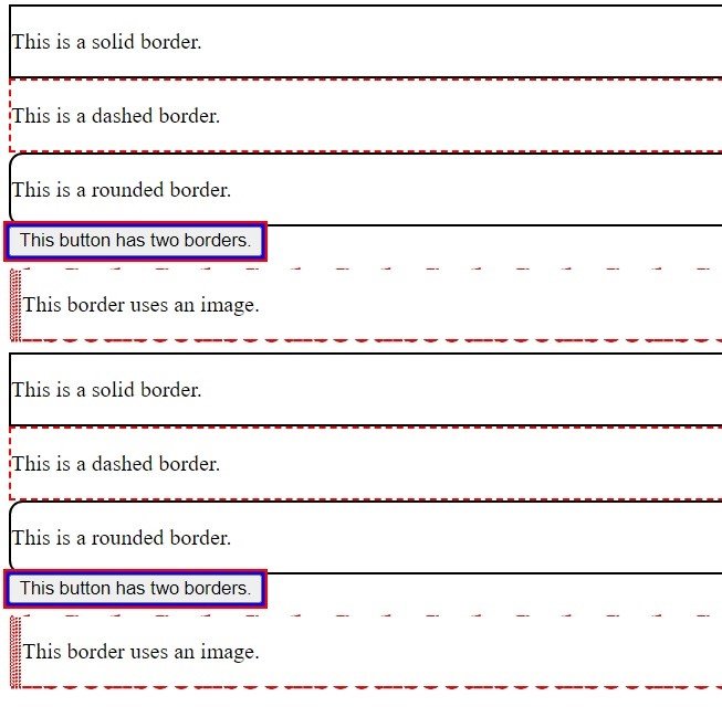
This is the complete code with HTML
|
1 2 3 4 5 6 7 8 9 10 11 12 13 14 15 16 17 18 19 20 21 22 23 24 25 26 27 28 29 30 31 32 33 34 35 36 37 38 39 40 41 42 43 44 45 46 47 48 49 50 51 52 53 54 55 56 57 58 59 60 61 62 63 64 65 66 67 68 69 70 71 72 73 74 75 76 77 78 79 80 81 82 83 84 85 86 87 88 89 90 91 92 93 94 95 96 97 98 99 100 101 102 103 104 105 106 107 108 109 110 111 112 113 114 115 116 117 118 119 120 |
<!DOCTYPE html> <html> <head> <title>CSS Borders Example</title> <style> /* Solid border */ #solid { border: 2px solid black; } /* Dashed border */ #dashed { border: 2px dashed red; } /* Rounded border */ #rounded { border: 2px solid black; border-radius: 10px; } /* Multiple borders */ #multiple { box-shadow: 0 0 0 2px blue, 0 0 0 4px red; } /* Border image */ #image { border: 10px solid transparent; border-image: url('geekscoders.png') 30% round; } </style> </head> <body> <!-- Solid border --> <div id="solid"> <p>This is a solid border.</p> </div> <!-- Dashed border --> <div id="dashed"> <p>This is a dashed border.</p> </div> <!-- Rounded border --> <div id="rounded"> <p>This is a rounded border.</p> </div> <!-- Multiple borders --> <button id="multiple"> This button has two borders. </button> <!-- Border image --> <div id="image"> <p>This border uses an image.</p> </div> </body> </html> <!DOCTYPE html> <html> <head> <title>CSS Borders Example</title> <style> /* Solid border */ #solid { border: 2px solid black; } /* Dashed border */ #dashed { border: 2px dashed red; } /* Rounded border */ #rounded { border: 2px solid black; border-radius: 10px; } /* Multiple borders */ #multiple { box-shadow: 0 0 0 2px blue, 0 0 0 4px red; } /* Border image */ #image { border: 10px solid transparent; border-image: url('flower.png') 30% round; } </style> </head> <body> <!-- Solid border --> <div id="solid"> <p>This is a solid border.</p> </div> <!-- Dashed border --> <div id="dashed"> <p>This is a dashed border.</p> </div> <!-- Rounded border --> <div id="rounded"> <p>This is a rounded border.</p> </div> <!-- Multiple borders --> <button id="multiple"> This button has two borders. </button> <!-- Border image --> <div id="image"> <p>This border uses an image.</p> </div> </body> </html> |
This is the result

