In this CSS Tutorial article we want to learn about CSS Hover Effects Tutorial, CSS hover effects are powerful tool for creating interactive and engaging web pages. by adding hover effects to your CSS code you can create dynamic and visually appealing effects that respond to user interactions. in this tutorial, we want to talk about the basics of using CSS hover effects.
CSS Hover Effects Tutorial
The most basic hover effect is changing the color of text or background when user hovers over an element. this is an example of how to create hover effect on a button:
|
1 2 3 4 5 6 7 8 9 10 11 |
button { background-color: #007bff; color: white; padding: 10px; border: none; cursor: pointer; } button:hover { background-color: #0056b3; } |
There are many more advanced hover effects that you can create using CSS. these are few examples, in this example we have an element with the class fade-in. by default the element is hidden with an opacity of 0. when a user hovers over the element, the opacity transitions to 1, creating fade in effect.
|
1 2 3 4 5 6 7 8 |
.fade-in { opacity: 0; transition: opacity 0.5s; } .fade-in:hover { opacity: 1; } |
In this example we have an element with class box-shadow. by default element has a box shadow of 10px. when a user hovers over the element, the box shadow transitions to 20px, creating a subtle but visually appealing effect.
|
1 2 3 4 5 6 7 8 |
.box-shadow { box-shadow: 0 0 10px rgba(0,0,0,0.5); transition: box-shadow 0.5s; } .box-shadow:hover { box-shadow: 0 0 20px rgba(0,0,0,0.5); } |
In this example we have an element with the class scale. by default the element is at normal scale (1). when a user hovers over the element, the scale transforms to 1.1, creating a zoom in effect.
|
1 2 3 4 5 6 7 8 |
.scale { transform: scale(1); transition: transform 0.5s; } .scale:hover { transform: scale(1.1); } |
This is the complete practical example
|
1 2 3 4 5 6 7 8 9 10 11 12 13 14 15 16 17 18 19 20 21 22 23 24 25 26 27 28 29 30 31 32 33 34 35 36 37 38 39 40 41 42 43 44 45 46 |
<!DOCTYPE html> <html> <head> <title>CSS Hover Effects Example</title> <style> button { background-color: #007bff; color: white; padding: 10px; border: none; cursor: pointer; margin: 10px; box-shadow: 0 0 10px rgba(0,0,0,0.5); transform: scale(1); transition: background-color 0.5s, box-shadow 0.5s, transform 0.5s; } button:hover { background-color: #0056b3; box-shadow: 0 0 20px rgba(0,0,0,0.5); transform: scale(1.1); } .container { display: flex; flex-wrap: wrap; justify-content: center; align-items: center; height: 100vh; } h1 { font-size: 2rem; margin: 0; } </style> </head> <body> <div class="container"> <h1>CSS Hover Effects Example</h1> <button>GeeksCoders.com</button> <button>Hover Over Me Too</button> <button>And Me Too</button> </div> </body> </html> |
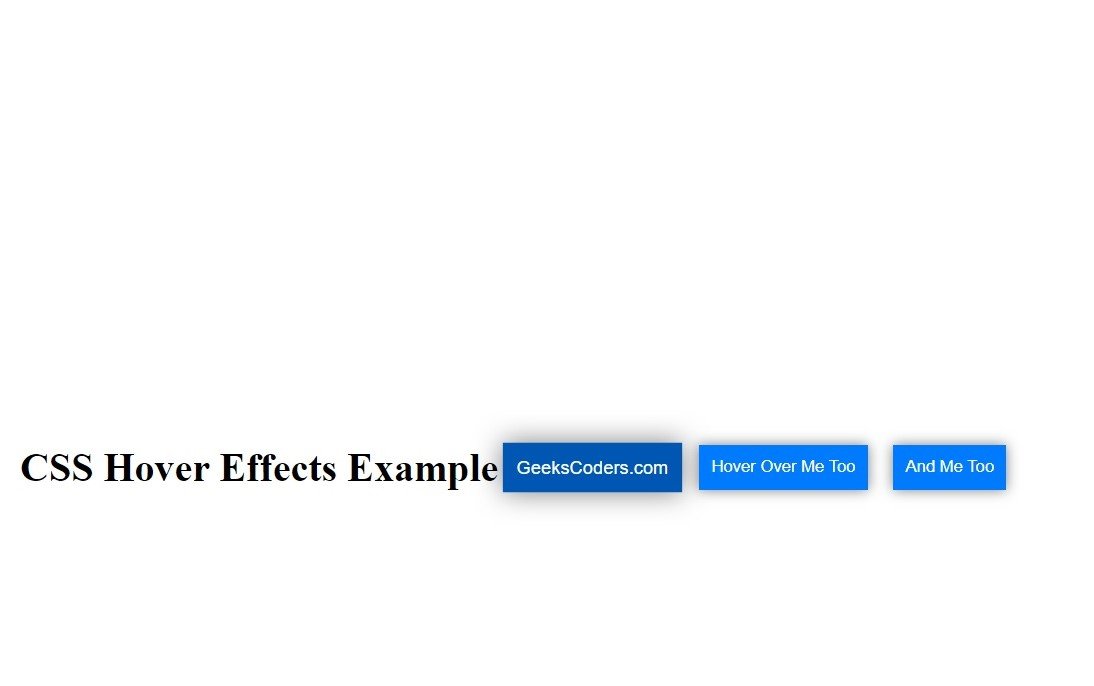
In this example we have container div with three buttons inside. each button has a blue background color and white text. when a user hovers over button the background color changes to a darker shade of blue, the box shadow increases, and the button scales up slightly. we also have a title at the top of the page with a larger font size.
This example shows how you can use CSS hover effects to create visually appealing and interactive user interface. by adding hover effects to buttons or other interactive elements you can make your website feel more dynamic and engaging for users.
This will be the result

Learn More on CSS
- How to Center Text in CSS
- CSS Animation Tutorial
- CSS Grid Tutorial
- How to Use Flexbox in CSS
- How to Create CSS Dropdown Menu
- CSS Border Tutorial
- CSS Box Model Tutorial
- How to Style Form Elements with CSS
- How to Create CSS Tooltip
- CSS Typography Tutorial
- CSS Variable Tutorial
