
In this lesson i want to show you How to Create Bar Plot with Pandas crosstab, we are going to use Pandas library with crosstab function from Pandas.
What is Pandas ?
Pandas is an open source data analysis and data manipulation library for Python. it provides data structures and functions needed to work on structured data. with its intuitive and easy to use API, Pandas makes it simple to perform operations on large datasets including filtering, aggregating, transforming and cleaning data.
Pandas is particularly good for working with structured data such as spreadsheets or SQL tables and provides fast and flexible data structure for analyzing and manipulating data.main data structure provided by Pandas is DataFrame, which is two dimensional labeled data structure with columns of potentially different data types. Pandas also provides different of other data structures and functions for working with time series data, categorical data and missing data, among other things.
In addition to its data manipulation capabilities, Pandas also provides powerful data analysis tools including grouping and aggregation, merging and joining and reshaping and pivoting data. these tools make it easy to perform complex data analysis tasks such as summarizing and aggregating data, calculating correlations and regressions and visualizing data.
In result we can say that Pandas is highly powerful library that is widely used by data scientists, statisticians, and analysts for a wide range of data analysis tasks. you can install pandas using this command:
|
1 |
pip install pandas |
How to Create Bar Plot with Pandas crosstab
Pandas crosstab function can be used to create a contingency table (also known as a cross tabulation or pivot table) that summarizes distribution of categorical data across two or more variables. the crosstab function returns Pandas DataFrame that can be easily plotted using the plot method such as bar plot.
This an example of how to use the crosstab function and the plot method to create a bar plot:
|
1 2 3 4 5 6 7 8 9 10 11 12 13 14 15 16 17 18 19 20 21 22 |
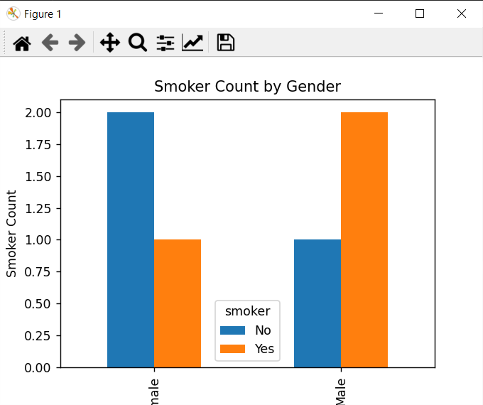
import pandas as pd import matplotlib.pyplot as plt # Create a sample dataframe df = pd.DataFrame({'gender': ['Male', 'Female', 'Male', 'Female', 'Male', 'Female'], 'smoker': ['Yes', 'No', 'No', 'No', 'Yes', 'Yes'], 'age': [25, 30, 35, 40, 45, 50]}) # Use the crosstab function to create a contingency table ct = pd.crosstab(df['gender'], df['smoker']) # Plot the contingency table as a bar plot ct.plot(kind='bar', stacked=False) # Add a title and axis labels plt.title('Smoker Count by Gender') plt.xlabel('Gender') plt.ylabel('Smoker Count') # Show the plot plt.show() |
In this example first we have created sample dataframe with three columns: gender, smoker and age. after that we have used crosstab function to create contingency table that summarizes the distribution of smoker by gender. finally we have used plot method to create bar plot of the contingency table, add a title and axis labels and display the plot.
Run the complete code and this wil be the result.
Learn More on Python
- How to Add Matplotlib in TKinter Window
- How to Make an Instagram Bot
- How to send Message to Instagram with Python
- TKinter Application with Dialogs
- Build Multi Window Application with TKinter
- How to Build Charts in TKinter
- How to Install TKinter in Windows and Linux
- How to Use ChatGPT in Python
- Which Websites are Made with Django
